How Sora 2 Will Revolutionize Ecommerce Conversion Rates
Discover how to start improving ecommerce conversion rates with proven strategies on AI video, checkout optimization, and building customer trust.
If you’re serious about improving your ecommerce conversion rate, you have to stop throwing spaghetti at the wall and hoping something sticks. It’s not about just changing button colors or A/B testing headlines randomly. It's about a systematic process of diagnosing the friction points in your customer journey and leveraging next-generation tools like the Sora 2 video generator to create compelling experiences based on real data.
The first step is always to understand where people are dropping off and, more importantly, why. Is it a flat product page? Confusing descriptions? An inability to visualize the product? Let's dig in.
Diagnosing Your Store's Conversion Gaps
Before you touch a single product image, you need to put on your detective hat. Looking at your store's overall conversion rate is like seeing the final score of a game without watching any of the plays—it tells you if you won or lost, but gives you zero clues on how it happened.
The goal here is to move from guesswork to intelligent, data-backed improvements that actually move the needle. This diagnostic approach helps you prioritize the changes that will have the biggest impact, which is crucial when you have limited time and resources. For a solid foundation on this approach, check out a data-driven playbook for improving ecommerce conversion rates.
Pinpoint Where Customers Are Leaving
Your first mission is to find the leaks in your sales funnel. Think of your website as a series of pipes; where are the cracks? Is it on your product pages, in the shopping cart, or right at the final payment step? Tools like Google Analytics are perfect for visualizing this journey and seeing exactly where the friction is happening.
Start by asking a few critical questions about your funnel:
- High Bounce Rate on Product Pages? This could mean your product photos are weak, your descriptions are unclear, or customers can't visualize the product in use. This is where Sora 2 product videos can make a huge difference.
- Lots of "Add to Carts" but Few Checkouts? This classic problem often points to an issue in the cart. Surprise shipping costs are the number one culprit, but a confusing layout can also be to blame.
- High Checkout Initiation but Low Purchases? This is a huge red flag for checkout friction. Are you forcing people to create an account? Are there too many form fields to fill out on a tiny phone screen?
Segment Your Data for Deeper Insights
An overall conversion rate hides all the interesting details. The real "aha!" moments come when you slice and dice your audience data to analyze performance across different segments. This is how you uncover specific, actionable problems.
Before we get into segmenting, it helps to know where you stand.
Key Ecommerce Conversion Rate Benchmarks
This table shows average conversion rates across different traffic sources and platforms, helping you benchmark your own performance.
| Metric | Average Conversion Rate | High-Performer Goal |
|---|---|---|
| Overall Ecommerce | 2.5% - 3% | 5%+ |
| Shopify (Average) | 1.4% | 3.2%+ |
| Referral Traffic | 5.4% | 7%+ |
| Social Media Traffic | 0.7% | 2%+ |
| Email Marketing | 2.6% | 6%+ |
| Organic Search | 2.8% | 5%+ |
These numbers provide a great starting point. As you can see, the top 20% of Shopify stores hit 3.2% or more, which shows just how much room for improvement there often is. Notice how referral traffic converts at a whopping 5.4% while social media lags at 0.7%—it really underscores the power of a warm lead.
By segmenting your data, you stop asking, "What's my conversion rate?" and start asking, "What's my conversion rate for mobile users from TikTok who are viewing my best-selling product?" The second question is infinitely more useful.
Analyze by Traffic Source and Device
Not all traffic is created equal, not by a long shot. A visitor who clicks through from a trusted blog review is going to behave very differently from someone who clicked a TikTok ad on a whim. Analyzing your conversions by source tells you which channels deliver high-intent buyers and which ones are just sending window shoppers.
Seeing a ton of traffic from your TikTok campaign but zero sales? The problem might be a mismatch between your ad and the landing page experience. This is where a dynamic Sora 2 for TikTok ad can create better alignment.
Device type is another massive factor. A slow, clunky mobile experience is a guaranteed conversion killer today.
- Desktop vs. Mobile: If your desktop conversion rate is a healthy 3% but your mobile rate is a dismal 0.8%, you've just found your top priority: fix the mobile experience.
- Browser Type: It's less common, but sometimes your site might have a rendering issue on a specific browser (like Safari vs. Chrome), causing a dip in conversions for that segment of users.
By doing this initial audit, you'll walk away with a prioritized list of problems to solve. No more guessing. You now have a data-driven roadmap for making changes that will have a real, measurable impact. This diagnostic phase is the most critical part of the entire process.
Using Sora 2 AI Video to Showcase Your Products
In the world of e-commerce, especially on platforms like Shopify and TikTok, flat, static product images just don't cut it anymore. Your product page needs to feel like an experience, and honestly, the best way to do that right now is with video.
When it comes right down to it, improving ecommerce conversion rates is about one thing: helping your customer see themselves using your product. The new generation of AI video tools is a game-changer for this.
Tools like Sora 2 let you move way beyond boring photos and create cinematic product videos that stop the scroll. You’re not just listing features anymore; you’re showing them in action, building the kind of trust that leads to a sale.
Turn Product Descriptions into Stories People Care About
At its heart, a tool like the Sora 2 video generator is built on text-to-video capability. This means you can feed it a simple product description and get back a vivid, story-driven video. The real trick, though, is learning to write great Sora 2 prompts. Forget the technical specs and focus on action, emotion, and context.
For instance, don't just ask for "a video of our waterproof jacket." That’s boring and won't get you far. Instead, try something with a little more flavor:
A cinematic close-up of water droplets beading and rolling off the sleeve of a sleek, dark blue technical jacket during a heavy downpour in a lush, green forest. The mood is adventurous and rugged.
See the difference? This prompt creates a story. It answers the customer's real questions—how waterproof is it? Does it look good in action?—and connects with them on an emotional level.
Key Video Concepts That Actually Drive Sales
To really move the needle on conversions, your videos need a clear purpose. AI lets you experiment with different styles at scale, so you can tackle specific customer hesitations head-on.
Here are a few powerful concepts you can create with a Sora 2 storyboard generator:
- 360-Degree Product Demos: Nothing builds confidence like seeing every angle. Generate a seamless video showing off the craftsmanship, texture, and hidden features. This is gold for things like leather bags, detailed jewelry, or electronics.
- Lifestyle "In-Use" Shots: Show your product in the wild. A prompt can create a realistic scene of someone from your target audience actually using it—a designer using your notebook in a bustling coffee shop, for example. It makes the product instantly relatable.
- Compelling Unboxing Videos: Don't underestimate the power of a great unboxing experience. You can simulate the thrill of opening your package, highlighting beautiful branding and making the purchase feel more premium before it even arrives.
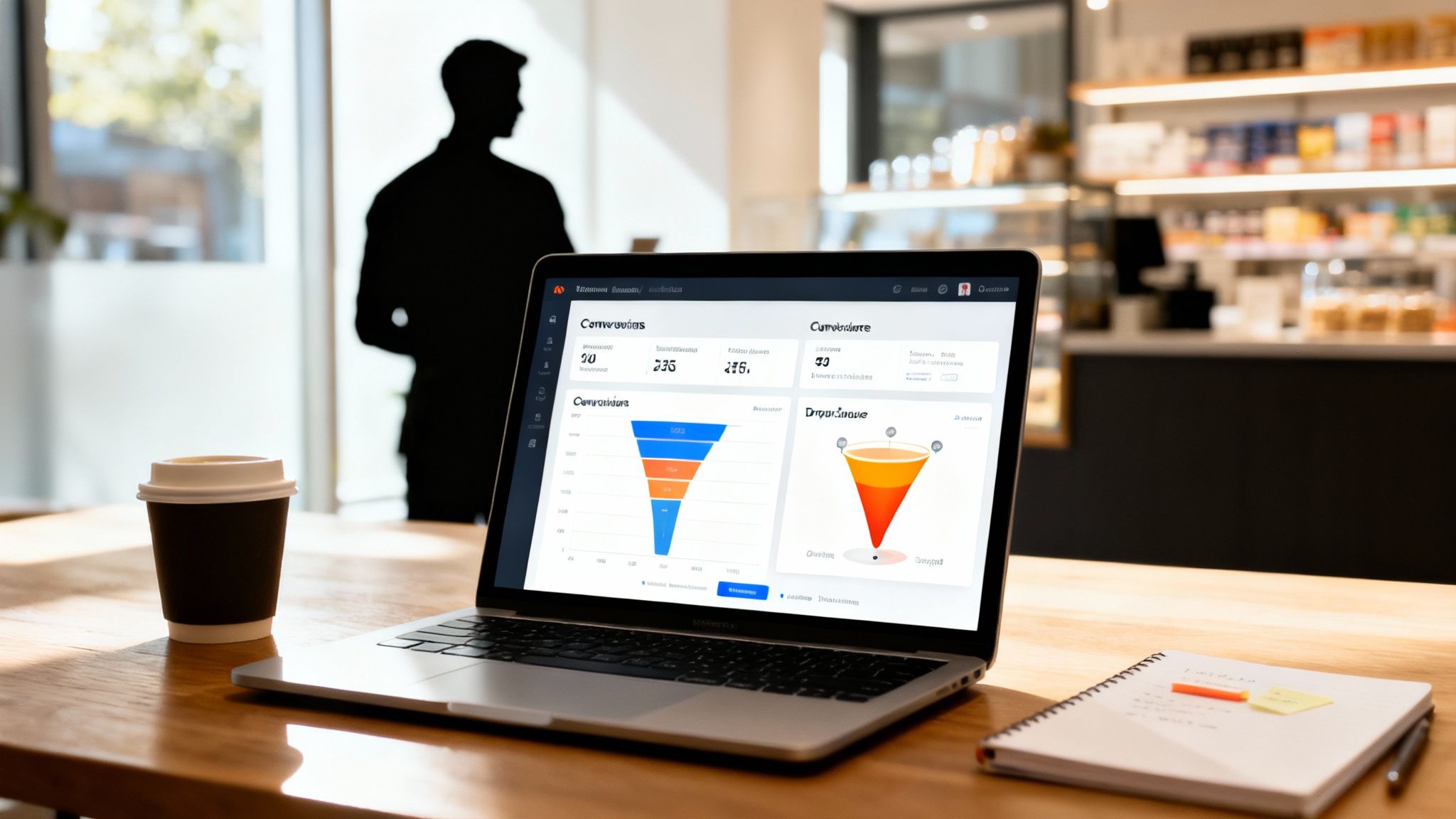
You can see from the interface of a tool like Saro2.ai how it's designed to turn simple ideas into a full visual sequence. For a busy Shopify seller without a film crew, this is huge.
Best Practices for Sora 2 Product Videos on Shopify and TikTok
Creating a great video is only half the battle. Where you put it and how you optimize it are just as crucial. A slow-loading video will kill your page speed and your conversion rate right along with it.
For Shopify Product Pages:
- Placement is Key: Don't make the video your main "hero" image. Slot it in as the second or third piece of media in your gallery. Let customers see the core product shot first, then wow them with the video.
- Keep it Short: People's attention spans are fleeting. Aim for 15 to 45 seconds. Get in, show the main benefit, and get out.
- Optimize for Speed: Always, always compress your videos. Look into apps or theme settings that "lazy load" video content, meaning it only loads when a user actually scrolls to it. This is a non-negotiable for protecting your page speed.
For Sora 2 for TikTok Ads:
- The 3-Second Rule: The first 3 seconds are everything. Use a Sora 2 style model to create an opening shot that’s impossible to ignore.
- Go Vertical: It sounds obvious, but you have to generate your videos in a 9:16 vertical aspect ratio. No exceptions.
- Sound On: Unlike a Shopify page where videos are often muted, TikTok is a sound-on environment. Think about trending audio when you're generating your video concepts to give your ads a much better shot at going viral.
By weaving AI-generated video into your product pages and ads, you're creating a much richer, more persuasive shopping experience. You're answering questions before they're asked, building serious trust, and giving customers that final nudge they need to hit "add to cart."
Building Unshakeable Trust and Social Proof

Trust is the invisible currency of every online sale. You can have the slickest Sora 2 product videos and a perfect pricing strategy, but without trust, it all falls flat. Think about it: shoppers rarely leave because they hate your product. They leave because something feels off or risky.
This is why building trust isn't just a nice-to-have; it's a non-negotiable part of improving ecommerce conversion rates. It’s a process that starts the second someone lands on your site and doesn't end until long after they've checked out. Your job is to create an environment where customers feel secure, confident, and genuinely reassured they're making a smart choice.
The Foundations of Online Trust
Before a customer ever reads a review, their brain is subconsciously scanning for basic signals that your store is legit. These are the absolute table stakes. Get them wrong, and you've lost the sale before it even begins.
A few things are simply essential:
- Security Badges: Logos from well-known names like Visa, PayPal, Apple Pay, or even security seals like McAfee near your checkout buttons work wonders to calm last-minute nerves.
- Clear Contact Information: Don't hide it. A visible email, phone number, or a clear link to a contact page shows there are real people behind the curtain.
- Professional Design: Your site's look and feel is its digital handshake. A clean, modern design with high-quality images and no broken links signals that you're competent and you care.
One of the most powerful trust signals you have is a crystal-clear, friendly return policy. Phrases like "Easy 30-Day Returns" on product pages and in your site footer can single-handedly crush purchase hesitation.
The Psychology of Social Proof
Once you’ve established that baseline trust, social proof comes in to seal the deal. It’s all based on a simple psychological trigger: when we're unsure what to do, we look to see what others are doing. For your store, this means proving that other people—people just like your potential customer—have already bought and loved your products.
But just having a few reviews isn't enough. The magic is in how and where you present them. The goal is to make your social proof feel incredibly relevant right at the moment a shopper's doubts are creeping in.
Strategic Placement for Maximum Impact
Think of social proof as a conversation. You wouldn't bombard a new acquaintance with your life story. Likewise, you need to deliver the right kind of proof at the right time in the customer's journey.
On Product Pages
This is where the real hesitation happens. A shopper is looking at your product and asking themselves, "Yeah, but will this actually work for me?" Your social proof needs to answer that question head-on.
- User-Generated Content (UGC): Nothing is more powerful than seeing photos and videos from real customers using your product in their own lives. If you sell apparel, a customer photo is infinitely more relatable than a studio shot.
- Filtered Reviews: Let people sort reviews by what matters to them. A skincare brand that lets users filter by "skin type" or a clothing store that filters by "fit" helps shoppers find a review from someone exactly like them.
During Checkout
Checkout is the final hurdle. This is where buyer's remorse can kick in before the purchase is even made. The social proof here needs to be quick, reassuring, and designed to normalize the decision.
- Review Snippets: A short, punchy quote right next to the "Complete Purchase" button can be the final nudge they need. Something like, "You're about to join 25,000 happy customers" can work wonders.
Elevating Social Proof with Sora 2 AI Video
Text testimonials are great. But video? Video is on another level. The problem has always been getting customers to actually record and send a video testimonial—it’s a huge ask.
This is where AI video generators can be a complete game-changer. Imagine taking your most powerful written customer quote and using a tool like the Sora 2 text-to-video generator to turn it into an authentic-looking video. You can craft a prompt that describes a relatable person sharing their positive experience, making your social proof far more dynamic and emotionally compelling. This is a core part of modern AI video marketing strategies.
To see just how well this works, check out these powerful testimonial ad examples that convert. This approach makes your best reviews work harder for you, building that unshakeable trust you need to turn hesitant shoppers into loyal fans.
Fine-Tuning Your Pricing, Shipping, and Perceived Value

Let's talk about the number one conversion killer: surprise costs at checkout. A customer can absolutely love your product, add it to their cart, and be ready to pull the trigger... until a steep, unexpected shipping fee pops up on the final screen. That's when the excitement dies and the cart gets abandoned.
This last-minute friction is a direct path to a lost sale. To genuinely start improving ecommerce conversion rates, you have to get your pricing and shipping strategy right. The goal is to make your offer so clear and valuable that hitting "buy" feels like a smart, easy decision, not a leap of faith.
Mastering Your Shipping Strategy
There's no magic bullet for shipping. The "best" strategy really depends on what you sell, your profit margins, and what your customers have come to expect. But the most important rule is to be upfront. Never, ever make someone wait until the final checkout page to find out what shipping will cost them.
Here’s a breakdown of the most common models I've seen work well:
- Free Shipping: This is the holy grail for a reason. It completely removes the top cause of cart abandonment. You can bake the cost into your product prices and offer it everywhere, or use a threshold like "Free shipping on orders over $75" to nudge customers into spending a little more.
- Flat-Rate Shipping: This is all about simplicity and trust. A single, predictable fee for all orders (or for orders within certain weight classes) removes the guesswork. Customers know exactly what to expect, which is a huge plus.
- Real-Time Calculated Rates: While this is the most accurate option for you as a merchant (pulling live rates directly from carriers), it can create price variations that might surprise customers. If you go this route, be crystal clear about how it works.
My biggest piece of advice? Shout your shipping policy from the rooftops. A simple banner at the top of your site—"Free Shipping on All U.S. Orders"—instantly removes a massive roadblock before a customer even starts shopping.
The Psychology of Pricing and Value
How you present your price is often just as crucial as the price itself. The real game is about boosting the perceived value of your products, making the customer feel like they’re walking away with an incredible deal. It’s all about using subtle psychological cues that nudge them toward a purchase.
This isn’t about just dropping your prices. It’s about framing them in a way that makes your value proposition impossible to ignore. A great Sora 2 video example can dramatically increase perceived value by showcasing the product's quality and utility.
Practical Pricing Tactics That Actually Work
You'd be amazed at how small tweaks to the way you display prices can impact conversions. It all comes down to understanding how our brains process numbers and value.
Charm Pricing
This is a classic for a reason. It's the simple act of ending your prices in the number nine. A price tag of $29.99 just feels psychologically cheaper than $30.00, even though it's only a one-cent difference. The brain latches onto the "2" instead of the "3," and the price instantly seems like a better bargain.
Bundles and Tiered Offers
Grouping related products together for a single, discounted price is a fantastic way to boost both your conversion rate and your average order value. It makes the decision easier for the customer and gives them the feeling of getting more for their money. Instead of selling a shampoo, conditioner, and hair mask separately, why not offer a "Complete Haircare Routine" bundle at a slight discount? It's a win-win.
Designing a Frictionless Checkout Experience
Let's talk about the final hurdle: the checkout. This is where all your hard work on product pages, videos, and trust-building pays off—or falls apart. A clunky, confusing, or surprising checkout flow is the number one reason potential revenue vanishes into thin air.
If you're serious about improving ecommerce conversion rates, creating a fast, seamless, and reassuring checkout isn't just a nice-to-have; it's absolutely critical. You want the customer to feel like hitting "buy" is the most natural next step, not a chore that sparks doubt.
Streamline the Path to Purchase
Think of it this way: every extra field, click, or page load is another chance for a customer to get distracted or change their mind. It’s no surprise that research shows 27% of users will ditch a form if it feels too long or complicated. Simplicity is your best friend here.
Your mission is to hunt down and eliminate any obstacle that slows the user down.
- Offer Guest Checkout: Forcing someone to create an account is a massive conversion killer. Always, always have a prominent guest checkout option. Let people buy with minimal commitment.
- Minimize Form Fields: Get ruthless. Do you really need their phone number right now? Can "First Name" and "Last Name" just be "Full Name"? Each field you cut brings that person one step closer to clicking "complete purchase."
- Use Progress Indicators: A simple visual bar showing "Shipping > Payment > Confirm" works wonders. It manages expectations, reduces anxiety, and keeps the momentum going because people know exactly where they are and how close they are to the end.
Offer Modern and Trusted Payment Options
The payment step is all about trust. When shoppers see familiar, secure payment options they already use, they're far more likely to follow through. If you only offer one way to pay, you're creating a roadblock for a huge chunk of your audience.
Offering express payment options like Apple Pay and Google Pay can be a game-changer for conversions, especially on mobile. They pre-fill all the information and lean on the built-in trust people already have with their devices.
Make sure your checkout page proudly displays these logos alongside the classics like Visa and Mastercard. If you're on Shopify, enabling Shopify Payments is the fastest way to get these one-click methods live and cater to how people actually want to buy today.
Build Confidence in the Final Moments
Even with a perfect flow, last-minute jitters are real. Your checkout page needs to actively reassure customers that they're making a smart, safe decision. This is your last chance to reinforce all the trust you've been building.
A few small signals here can have a massive impact.
- Display Security Badges: Visible security seals (like Norton or McAfee) and SSL certificate logos are instant visual cues that tell a customer their payment info is safe.
- Reiterate Key Benefits: A simple line of text right under the "Complete Purchase" button can be incredibly powerful. Remind them of what makes you great, like "Easy 30-Day Returns" or "Free Shipping Included."
- Provide Clear Error Messaging: There's nothing worse than a vague "error" message. If a card is declined, the message needs to say why. "Please check your expiration date" or "The CVC code is incorrect" helps the user fix the problem instead of just giving up.
When you stop treating your checkout like a simple form and start seeing it as the grand finale of the customer experience, you’ll plug the leaks in your funnel. A frictionless checkout turns all your hard work into what it’s supposed to be: sales from happy customers.
How to Measure, Test, and Refine Your Strategy
So, you've made some changes. Now what? Improving your conversion rate isn't a "set it and forget it" task. It’s a constant cycle of listening to what your customers are actually doing on your site. Making changes based on a gut feeling is just a shot in the dark—and a great way to waste time and money.
The only way to move forward is with a data-driven approach. This is how you shift from guessing what works to knowing what works, all based on real user behavior. It’s all about testing an idea, measuring the results, and then refining your strategy based on what you learn. You form a hypothesis ("I bet adding a Sora 2 product video will increase add-to-carts"), run an experiment, and let the numbers tell you if you were right.
Setting Up Simple and Effective A/B Tests
Your best friend in this process is the A/B test, also known as a split test. It sounds technical, but the concept is simple: you create two versions of something on your site (Version A is your current one, Version B is the new one) and show them to different groups of visitors. Whichever version performs better is the winner.
You don't need a crazy expensive setup to get started. The key is to focus your first tests on the pages and elements that have the biggest impact on a customer's decision to buy.
Here are a few high-impact ideas you can test right away:
- Product Video Thumbnails: That first frame of your Sora 2 ecommerce video is everything. Test two completely different thumbnails. Try one that’s a clean shot of the product versus another showing it being used in a real-life setting. See which one gets more people to hit play.
- Call-to-Action (CTA) Button Text: "Add to Cart" is fine, but is it compelling? Test it against something more benefit-focused, like "Get My Skincare Set" or "Upgrade My Style." You'd be surprised how much a small wording tweak can matter.
- Static Image vs. Sora 2 Video: This is the ultimate test. On your top product pages, test the original page with static images against a new version that includes a short, compelling AI-generated video. Measure the impact on add-to-cart rates and overall page conversions.
Monitoring Key Performance Indicators Beyond Conversions
While boosting your overall conversion rate is the main goal, that one number doesn't give you the full picture. To really understand your store's health and see the true effect of your tests, you need to keep an eye on a few other Key Performance Indicators (KPIs).
Tracking these related metrics helps you diagnose problems with much greater accuracy and gives you a more complete story of how users are behaving.
A drop in bounce rate combined with a longer time on page, even if the conversion rate stays flat initially, is a strong positive signal. It means your changes are making the page more engaging, which is often a leading indicator of future conversion lifts.
The whole point of many CRO efforts is to reduce friction and make things easier for the customer, just like in this streamlined checkout flow.
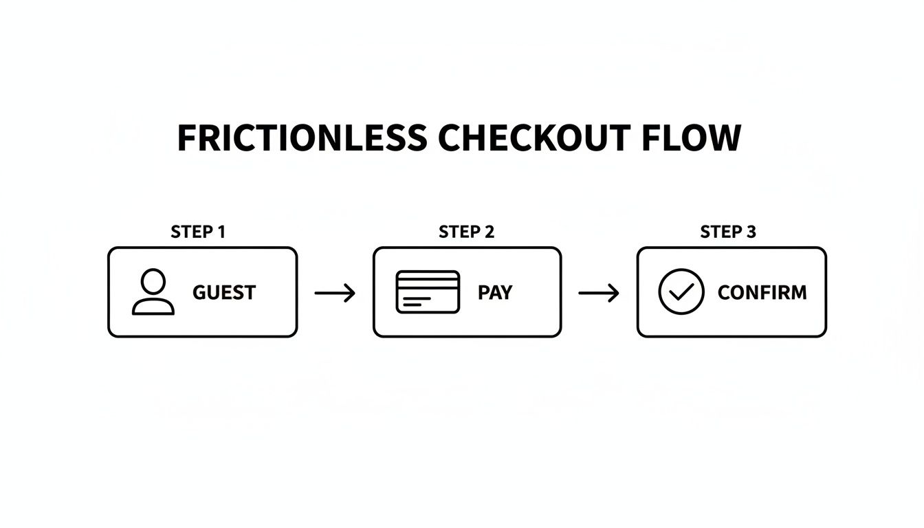
Every step here is about simplicity. The ideal customer journey is the one that requires the least amount of effort.
Creating Your Prioritized Testing Plan
You can’t test everything at once, and you shouldn't try. A simple, prioritized plan is what separates the pros from the amateurs. It helps you focus on the changes most likely to give you the biggest wins first. A great framework for this is the PIE model, which stands for Potential, Importance, and Ease.
- Potential: How much room for improvement does this page actually have? (A product page with a scary-high bounce rate has way more potential than a page that’s already converting well).
- Importance: How valuable is the traffic to this page? (Your best-selling product page is obviously more important to fix than a rarely visited policy page).
- Ease: How hard is this test going to be to set up? (Generating a video with a Sora 2 prompt is easy; a complete page redesign is hard).
By scoring your ideas with this framework, you can zero in on the low-hanging fruit—the high-potential, high-importance, and easy-to-implement tests. This is how you build momentum, get early wins, and create the engine that drives real, sustainable growth for your store.
Frequently Asked Questions
When you're deep in the weeds of optimizing your store, a lot of questions pop up. It's totally normal, especially when you're selling on fast-paced platforms like Shopify and TikTok. Let's tackle some of the most common ones we hear from founders trying to get more people to click that "buy" button.
What’s a Good Ecommerce Conversion Rate, Really?
Everyone wants to know the magic number, but the truth is, it depends. While you might see a global average thrown around—somewhere between 2.5% to 3%—that figure doesn't tell the whole story. Your industry, how much your products cost, and where your traffic comes from all play a huge role.
If you're on Shopify, the average conversion rate is about 1.4%. A good starting goal is to get above that. The stores that are really crushing it? They're often hitting 3.2% or even higher.
My best advice is to stop chasing a universal benchmark. Instead, focus on beating your own numbers. A steady month-over-month improvement is a much healthier and more realistic sign of success.
How Can AI Video from Sora 2 Actually Help Me Sell More?
AI video tools, like the Sora 2 text-to-video generator, are a game-changer because they help shoppers see themselves using your product. That’s the critical moment where a "maybe" turns into a "yes." Static photos just can't do that.
Think about what you can create in minutes:
- Dynamic Product Demos: No more guessing. Show off every feature from every angle, in action.
- 360-Degree Views: This builds serious confidence. A customer who has seen the entire product feels like they know what they're getting.
- Lifestyle Videos: Put your product in a setting your customers recognize and aspire to. Help them imagine it in their own lives. These are perfect Sora 2 video examples for your product page.
These videos answer questions before they're even asked, build trust, and forge an emotional link that a simple product shot can't. The result? Less hesitation and a real, measurable bump in your add-to-cart rate.
What’s the #1 Reason People Abandon Their Carts?
Surprise costs. Hands down. Nothing kills a sale faster than an unexpected shipping fee popping up at the very last second. It feels like a bait-and-switch, and it completely shatters the trust you just spent all that time building.
The fix is surprisingly simple: be transparent from the start.
Show every single cost, especially shipping, as early as you possibly can. Put it right on the product page or make it crystal clear in the shopping cart. Offering a free shipping threshold ("Free shipping on orders over $50!") or a simple flat rate are two of the most powerful ways to stop those last-minute drop-offs.
Ready to create product videos that actually get people to buy? The Saro2.ai AI video generator makes it easy to produce stunning, cinematic content from a simple text prompt. Transform your product pages and ads today at https://saro2.ai.